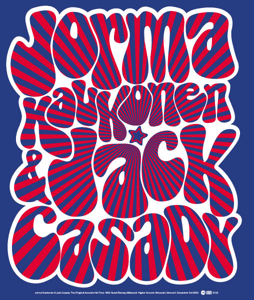
“This is the first poster I ever worked on for Higher Ground. Inspired by my old Fillmore posters (but nowhere near as good), I set out to create psychedelic typography that would mess with your eyes. There’s a time and a place for everything, but I’m not so sure anymore about bastardizing the Bellbottom typeface like this. In fact, I’m not so sure about Bellbottom period.”
-Peter Sunna, designer
